Akeneo - Data Quality Insight
During 2020, I had the chance to work on the launch of a brand new feature for Akeneo: Data Quality Insights
For more than 4 years at Akeneo, I had the opportunity to work on different topics: product launches such as Akeneo Onboarder and Akeneo Shared Catalog, topics around Product Led Growth, or the improvement of our User Research process. I also had the opportunity to work on the launch of several features. One of the most complete projects I had the opportunity to work on was the launch of a brand new feature for our users. The goal of this feature was to help our users to improve the quality of their product data: Data Quality Insights was born.
Akeneo is a global leader in Product Experience Management (PXM) helping businesses with products to sell, to unlock growth opportunities by creating a single source of truth for product information, and delivering a consistent and compelling omnichannel product experience. As a software vendor, Akeneo is specialized in editing a Product Information Management (PIM) solution. It provides a single place to collect, manage, and enrich your product information, create a product catalog, and distribute it to your sales and eCommerce channels. A PIM solution makes it faster and easier to create and deliver compelling product experiences.
I had the opportunity to work on this project with Florence Le Guellec as Product Manager and Aymeric Planche as lead developer. Julian Prud'homme, Laurent Pétard, and Olivier Pontier were the technical teams without whom the project would not have been possible.
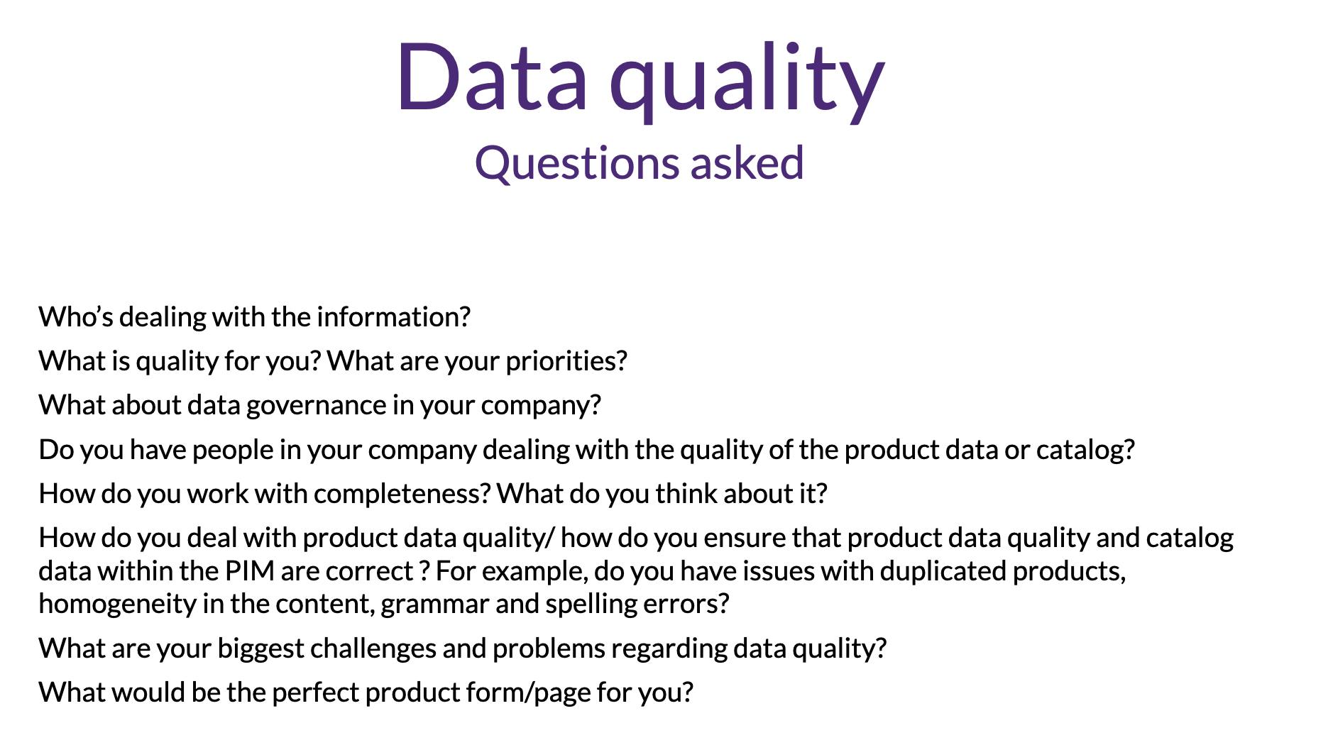
In the beginning, we decided to carry out user research for 2 months. The goal of this research was to guide us to design the best feature for our users. It was also the opportunity for us to better understand what data quality meant for our customers. First, we wrote a user research plan in order to define the scope, the resources, the planning, and our goals. During this discovery phase, we had the chance to interact with more than twenty customers in two different ways: remote video interviews, especially for our non-European customers, and focus groups conducted with our French customers during a day in Paris. This last event was organized with the help of the Customer Success team.
At the end of this discovery phase, we were able to present the results to the management team to determine, together, which users' problems we wanted to solve.
This study allowed us to better understand our customers in the field of data quality. For example, we were convinced that the quality of assets such as images or pictures as part of their quality criteria. We found out that, even if the quality of products assets are important, that this is something that isn't managed by our users, but by photographers or studio directly.
Therefore, we designed a user journey map to represent the path of our persona, Julia, when she has to deal with data quality. We found out that she had to face a lot of issues: an important usage of Excel to determine the quality of the product information, "random" proofreading on some product information to check for spelling mistakes in the texts for example, and no reporting tools to capture a snapshot of the status of data quality in her catalog. This research also helped to determine what were the quality criteria our customers had.
Right after this research, we started the delivery phase. As a team, we had numerous example mapping meetings and event storming workshops in order to define, together, the best solution and the experience we wanted for our users.
We thus created Data Quality Insights, a feature that is part of the daily use of our product, helping them to ensure that the quality of their products is the best. We had three main objectives for this feature:
- the feature had to be easy to use: the quality criteria can be overwhelming. Therefore, it was important for users to design an easy-to-use feature.
- the feature had to be actionable: the PIM is a productivity tool. The reduction of a task's time is always a plus for our users. To help them to be more productive was important for us.
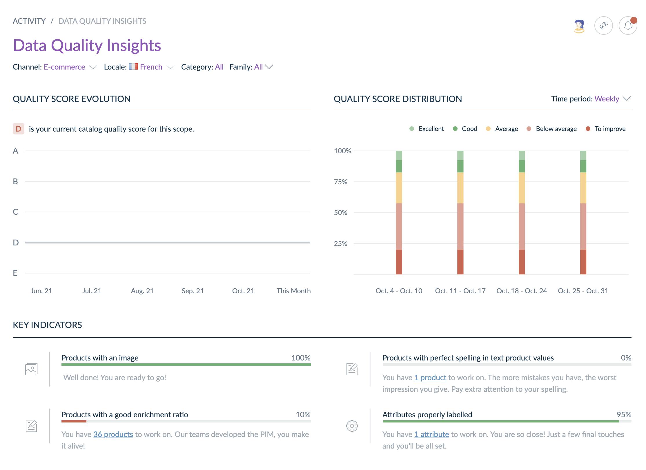
- the feature had to deliver reports in terms of data quality. As Julia, our persona needs to work on a daily basis on her catalog quality, she needs to report that her job has an impact on the business value of her company. That's why we've created a dashboard for her to track her work. Also, it's a helpful tool for her manager in order to understand how data quality evolves in the last days, weeks, or even months.
I started to design wireframes to imagine what this Data Quality Insights experience could look like for our customers. We validated them with the technical team to be sure we were aligned and that was feasible.
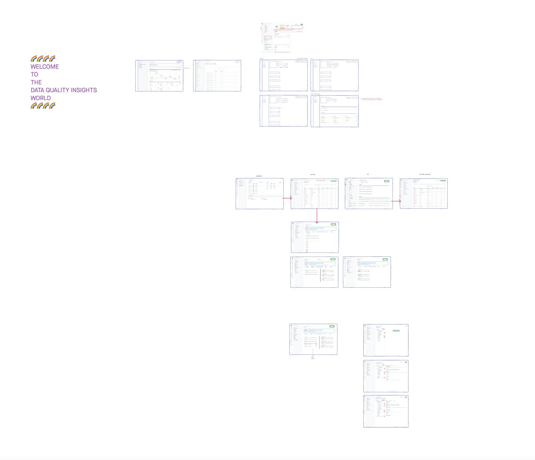
Then, I created all the mockups in Sketch thanks to our Design System.
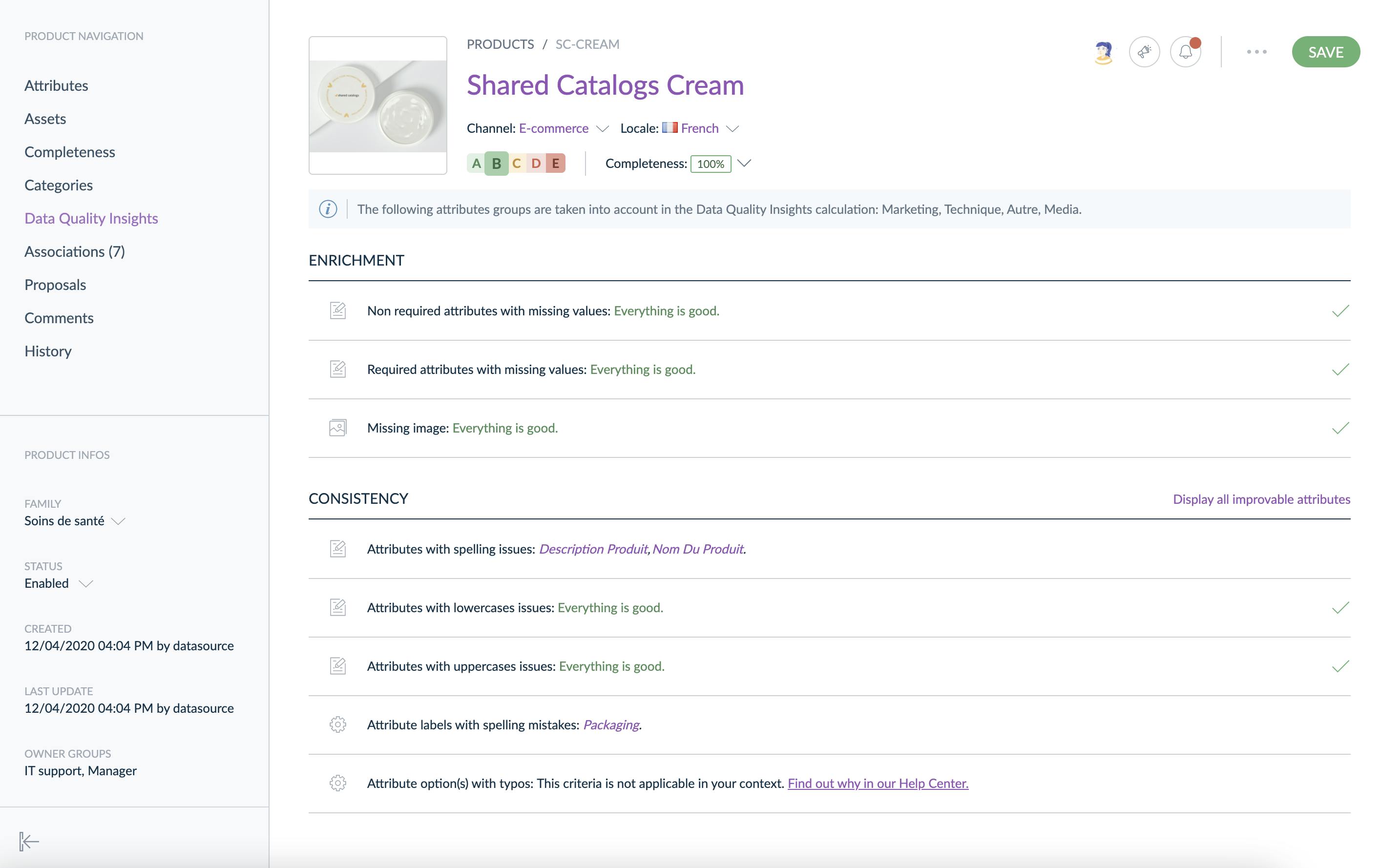
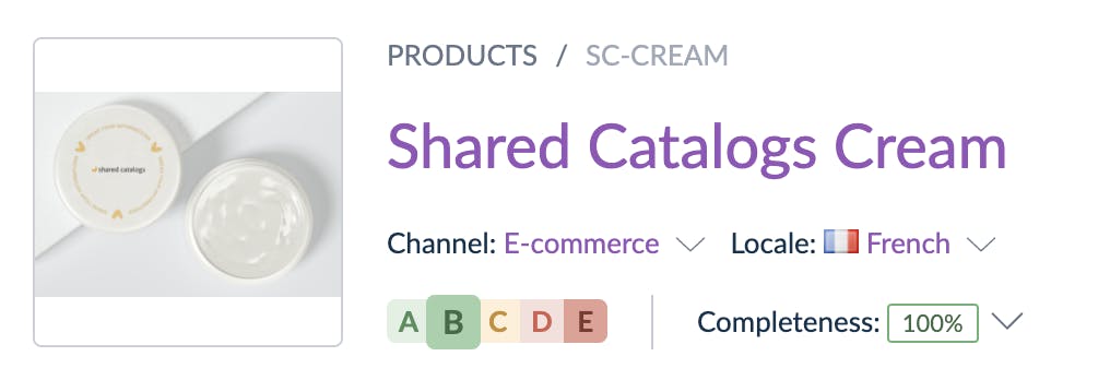
Our idea was to create a Quality Score, with grades going from A to E, largely inspired by the Nutri-Score, Eco-Score, or DPE scores. This product quality score guides our users to improve the quality of their product data.
Once the feature was available, we had a lot of positive feedback on how this feature is helping our customers to have the best data quality ever! Also, we had negative feedback that helped us to improve ourselves to deliver the best possible experience.